[BUG] Font Awesome icons are sized too narrow in the Material skin

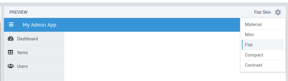
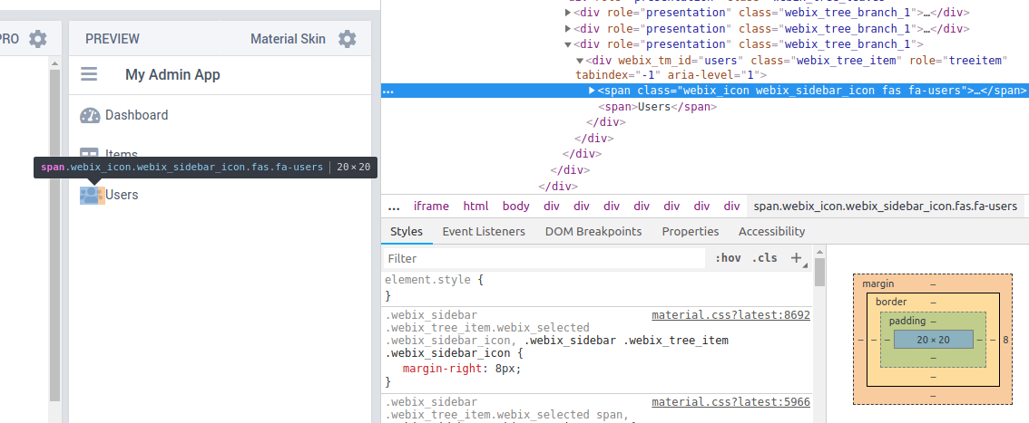
Please check this sidebar menu snippet and change skins between Flat and Material. Notice that in the Material skins, the icons are sized 20x20, while in Flat, they’re sized 44x17. This is incorrect - some icons, like fa-users, are much wider than 20px and will exceed the allocated dimension, almost overlapping the sidebar menu item text.

Flat skin has adequate padding around sidebar menu item icons:

Hello,

The point is that Webix provides predefined sets of icons depending on the used skin:

Webix Material Icons for Material and Mini skins, which based on Material Design Icons collection. At the same time, FA icons were used in the example, which are a little wider.

Webix Awesome Icons for Flat, Compact and Contrast skins - based on Font Awesome 5 collection. So, your example will look good if you use Flat skin for example.

But, if you want to use FA icons in Material skin, so you can solve the issue via CSS with a specific selector