Hello, Alexander!
- Horizontal timeline
a. to the right on the timeline display “tasks/services” as rectangles,
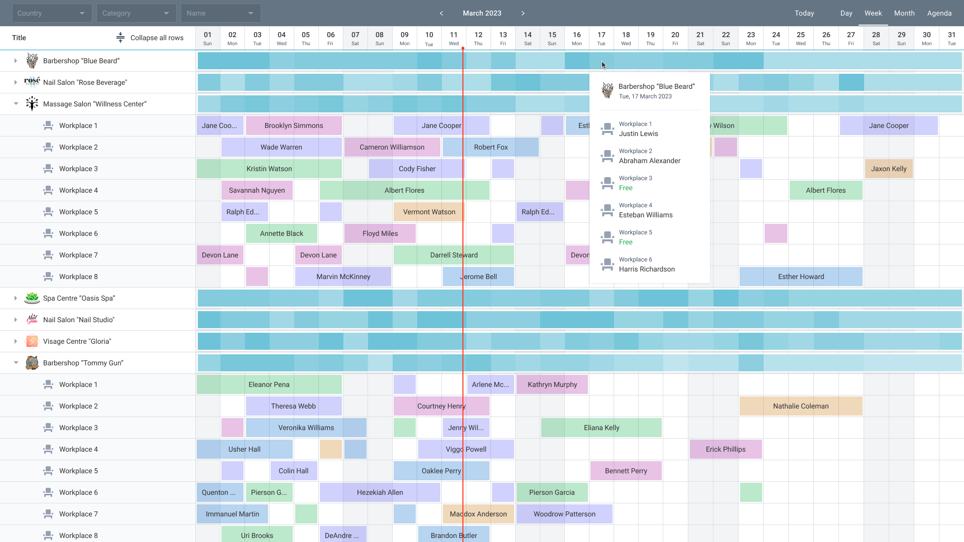
Based on the description, the scheduler in timeline mode is suitable for your task. It provides:
- a horizontal time scale (days, weeks, months);
- display of tasks/services as colored rectangles on the time grid;
- binding events to service objects (resources).
By default, the timeline shows 5 rows per unit to prevent events from overlapping: Code Snippet
If you need a classic “single-line” view, you can override the GetSectionHeight method.
Example with one row per section: Code Snippet
When using one row per unit, multiple events that belong to the same service object in the same time interval will visually overlap because they are placed on the same track. To avoid this, you can either keep the default 5 rows (in which case events are automatically distributed across levels) or implement your own layout logic.
The ability to show aggregated group occupancy (as in your screenshot: the more events in the interval, the darker the bar) is generally feasible. To do this, you would need to draw a custom indicator for parent units based on an event bar. It would not be editable, only visually reflect the density of events. There is no exact ready-made solution at the moment, but we will work out the optimal customization method.
b. vertically Service Objects (grouped – specified outside the control)
The scheduler timeline itself does not support hierarchical grouping of resources. The left panel and the right scale are synchronized and expect a strictly flat list of sections with id and text fields.
Therefore, as you planned, grouping of objects must be implemented outside the control using a separate tree. The scheduler will then receive an already filtered flat list of the required objects. Here is a basic example with a flat list: Code Snippet
To demonstrate exactly how grouping is done “externally”, I have prepared an example with a dropdown list. The user selects a category, and the scheduler dynamically rebuilds, showing only the necessary objects: Code Snippet
- For “task/service” – configure tooltip display and open (click) action
In the scheduler (timeline), customizing the tooltip and the click behavior on an event is achieved by inheriting the scheduler.views["modes/timeline/chart"] class and overriding its methods:
GetTooltip(obj) generates the tooltip content (HTML or text) that appears when hovering over the event rectangle.
ShowEvent(e) is called when clicking on an event. The base implementation sets the selection (this.State.selected), but you can add your own logic: opening an edit form, showing a message, etc.
Example implementation: Code Snippet
- Interactivity
a. Change the scale “month/quarter/year” and move
The scheduler in timeline mode natively provides all of the listed features. The top toolbar already has buttons for switching modes: Day, Week, Month, Year.
b. Move tasks – left/right
By default, all events can be dragged horizontally (left/right).
c. Shrink/expand tasks
Events can be shrunk/expanded by dragging their right or left edge. This also works by default.
- Configure a color legend for periods on the timeline (like weekends, but in a different color).
You can highlight any date ranges (weekends, holidays, non-working shifts) with a colored background directly on the time grid. This is implemented by extending the scheduler.views["modes/timeline/chart"] class and adding a custom highlighting layer.
Example implementation (in the example, Saturdays and Sundays are highlighted, but the condition can be replaced with any other): Code Snippet
In this example:
- create a
DrawHighlights() method, which is called after each event re-rendering.
- inside it, iterate through all days/cells of the current scale.
- for each date, check the condition (e.g., whether the day is a weekend).
- calculate the left position and width using
GetUnitPosition().
- insert absolutely positioned
divs with the desired background color into the event container (this._DataObj).
Best regards,
Webix support team